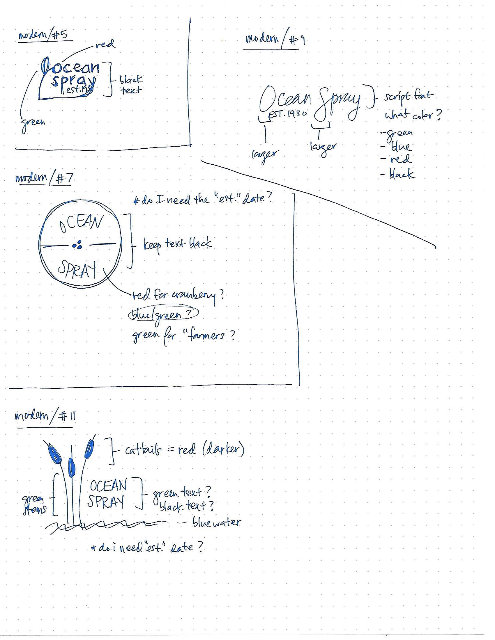
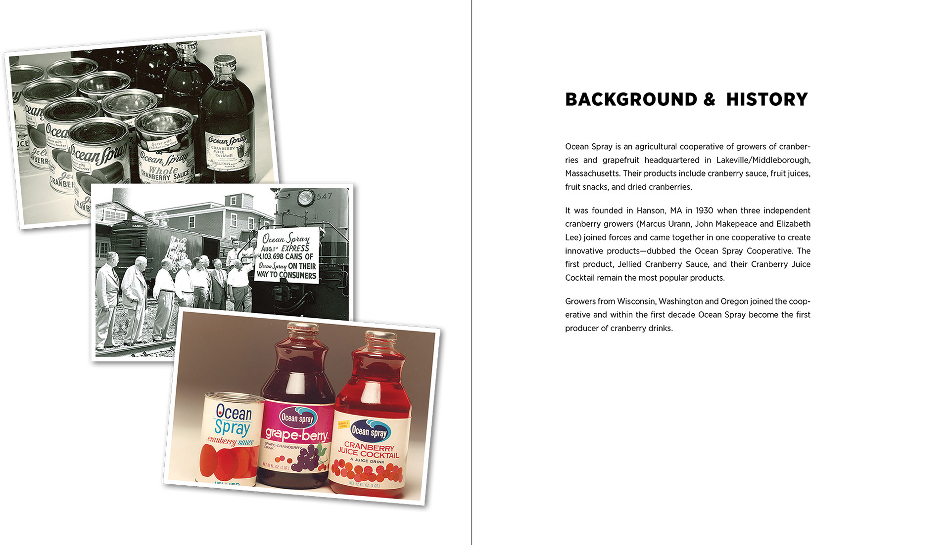
The design problem/prompt was to select and research an existing brand, Ocean Spray, and then update it. Based on my gathered research, I felt like the “heart” of the Ocean Spray brand was the cranberry and the farmers. Current branding feels disconnected from both of those things, so I developed something different that showcased the history of the company that I felt better incorporates the cranberry.
This was a class project (fall 2018) with a 4-week timeline.
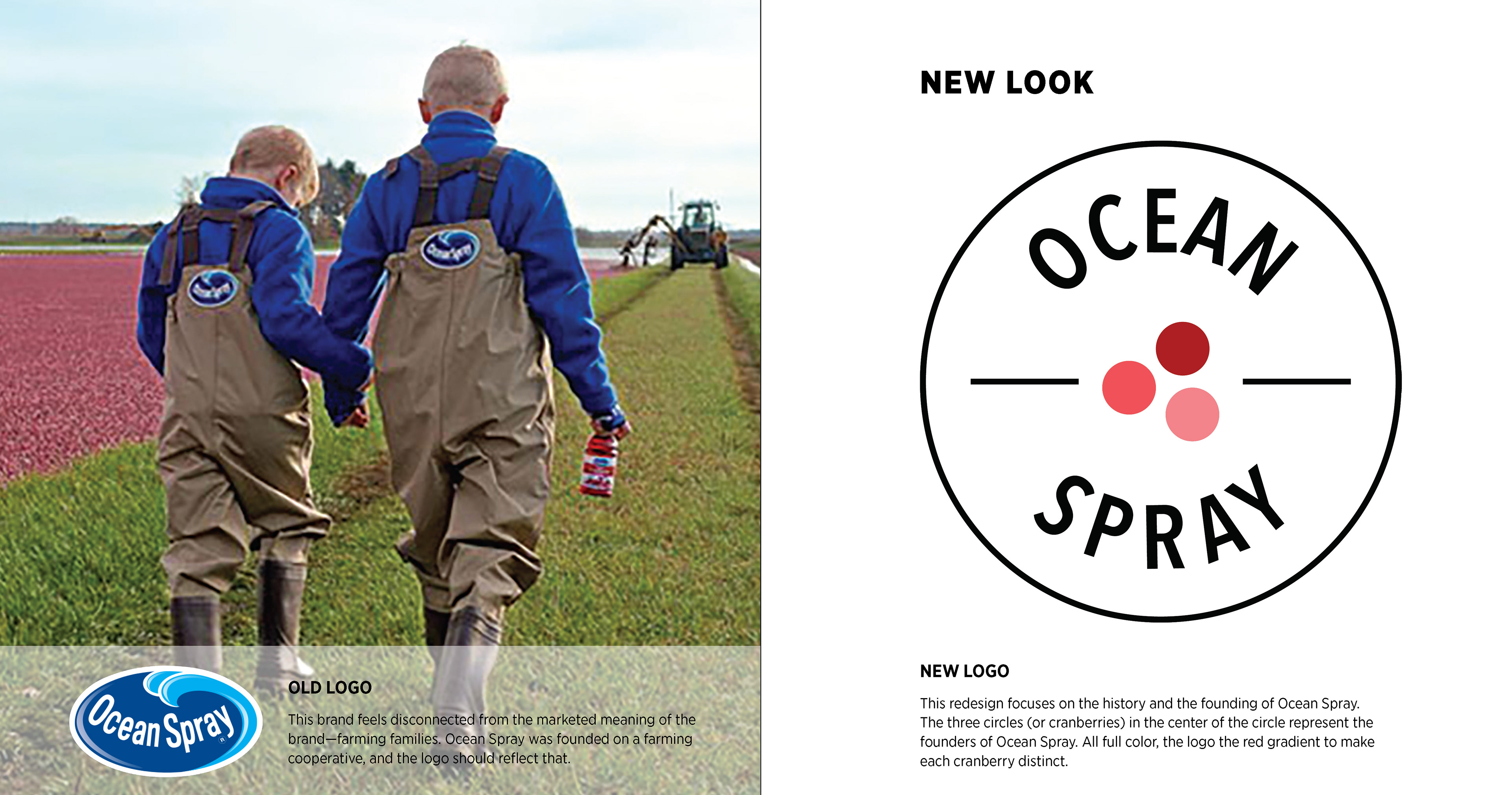
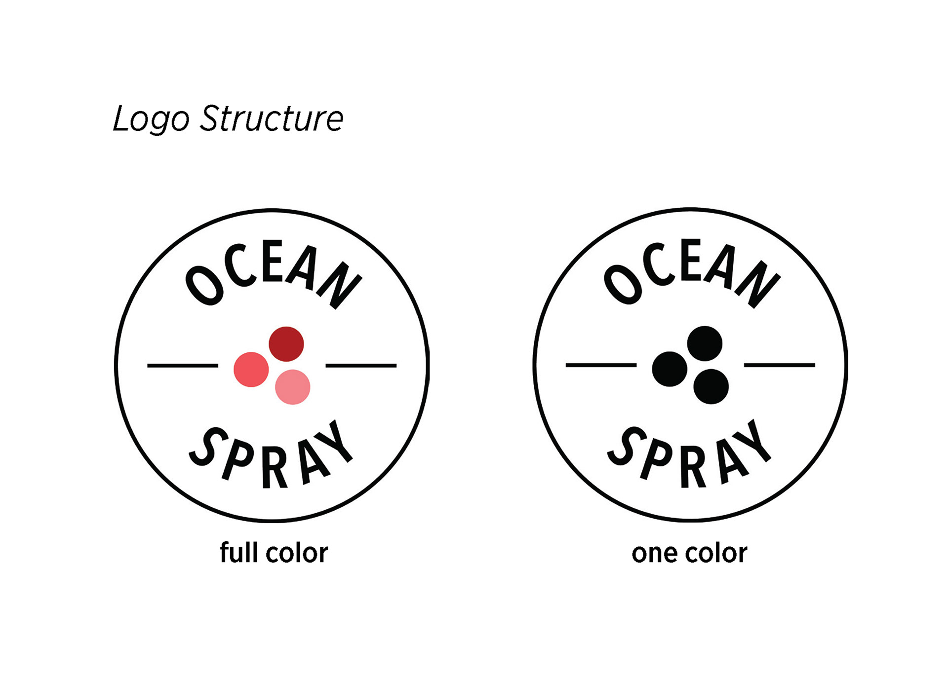
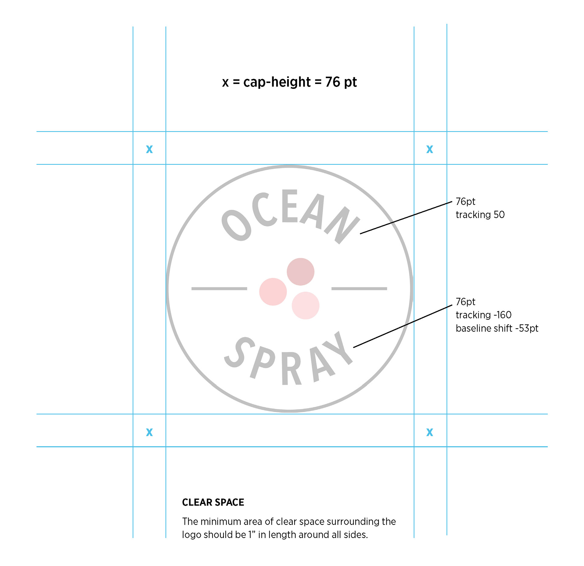
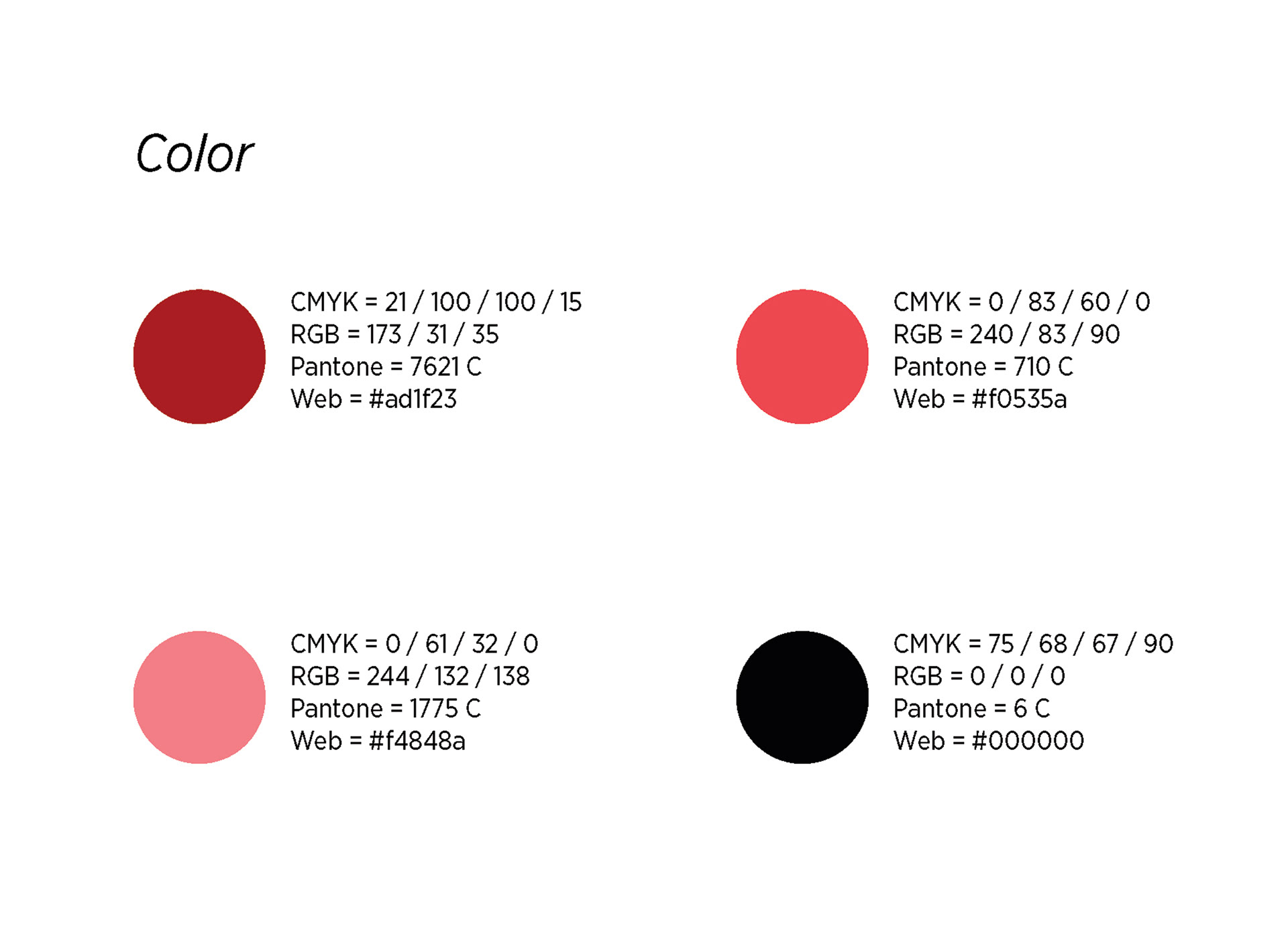
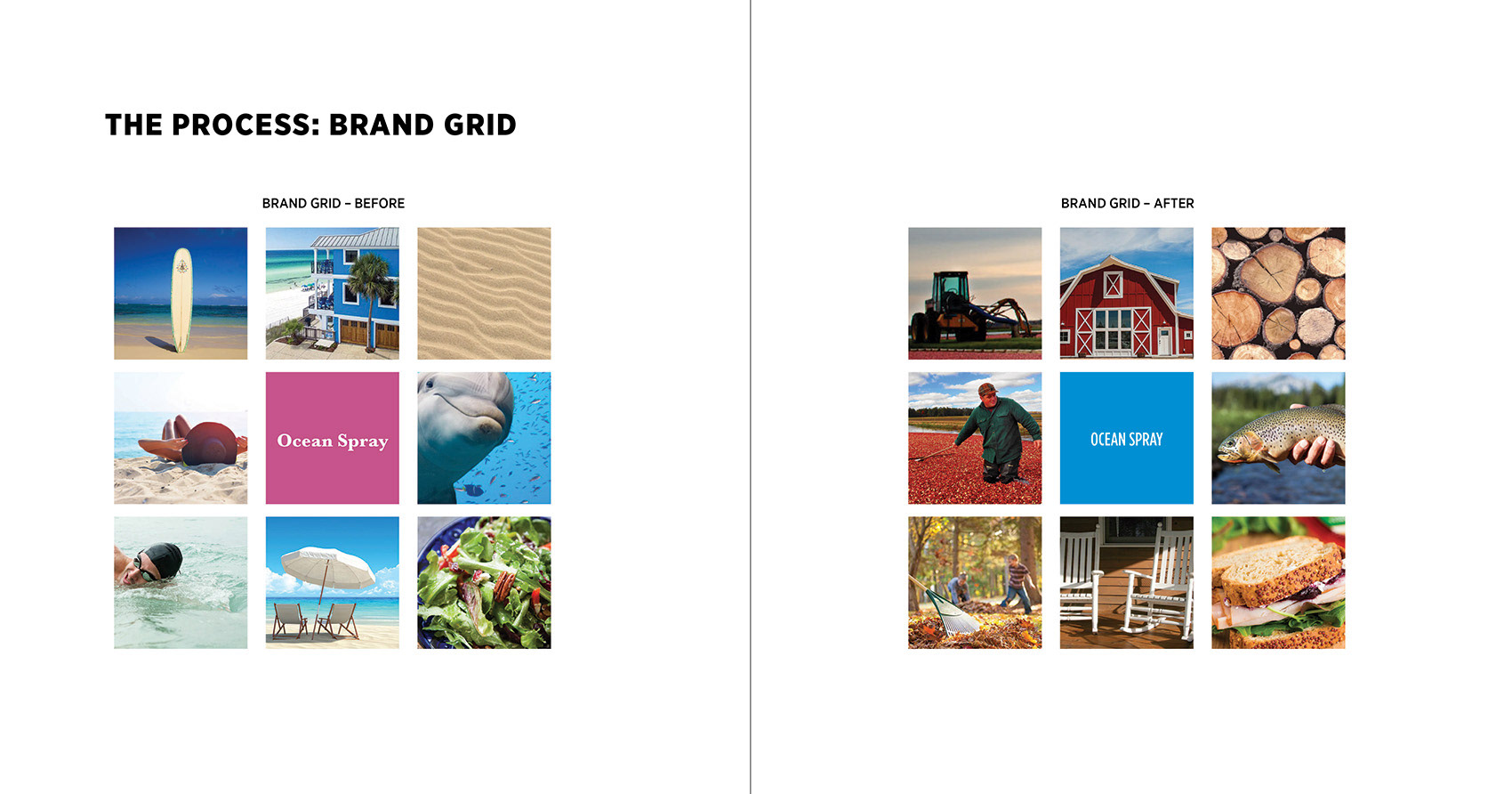
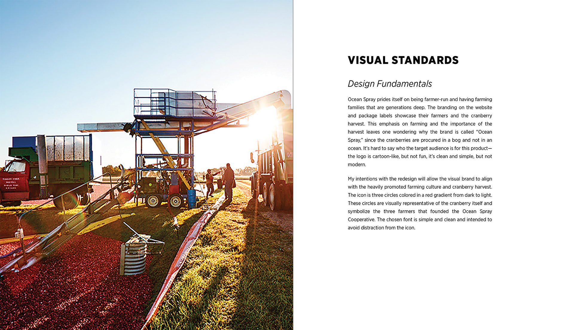
Below are 1) the comparison grid used to examine current branding and vision for rebranding, 2) the background of the chosen company, and 3) an explanation of visual standards. Based on what I learned during the research phase, Ocean Spray visually represents itself as very farmer-centric. Most of the imagery used on the website is of the cranberry harvest. I thought the logo should match the visuals online.
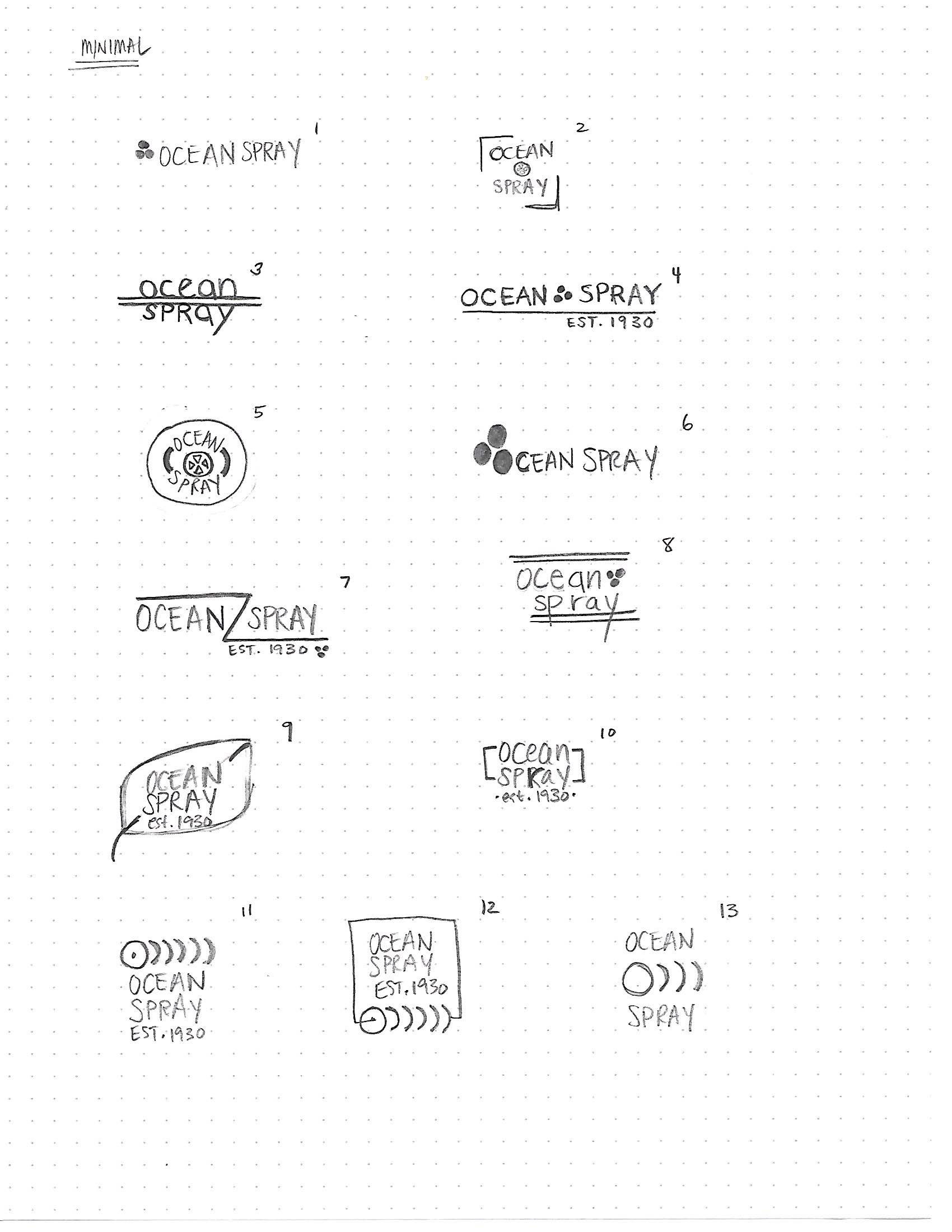
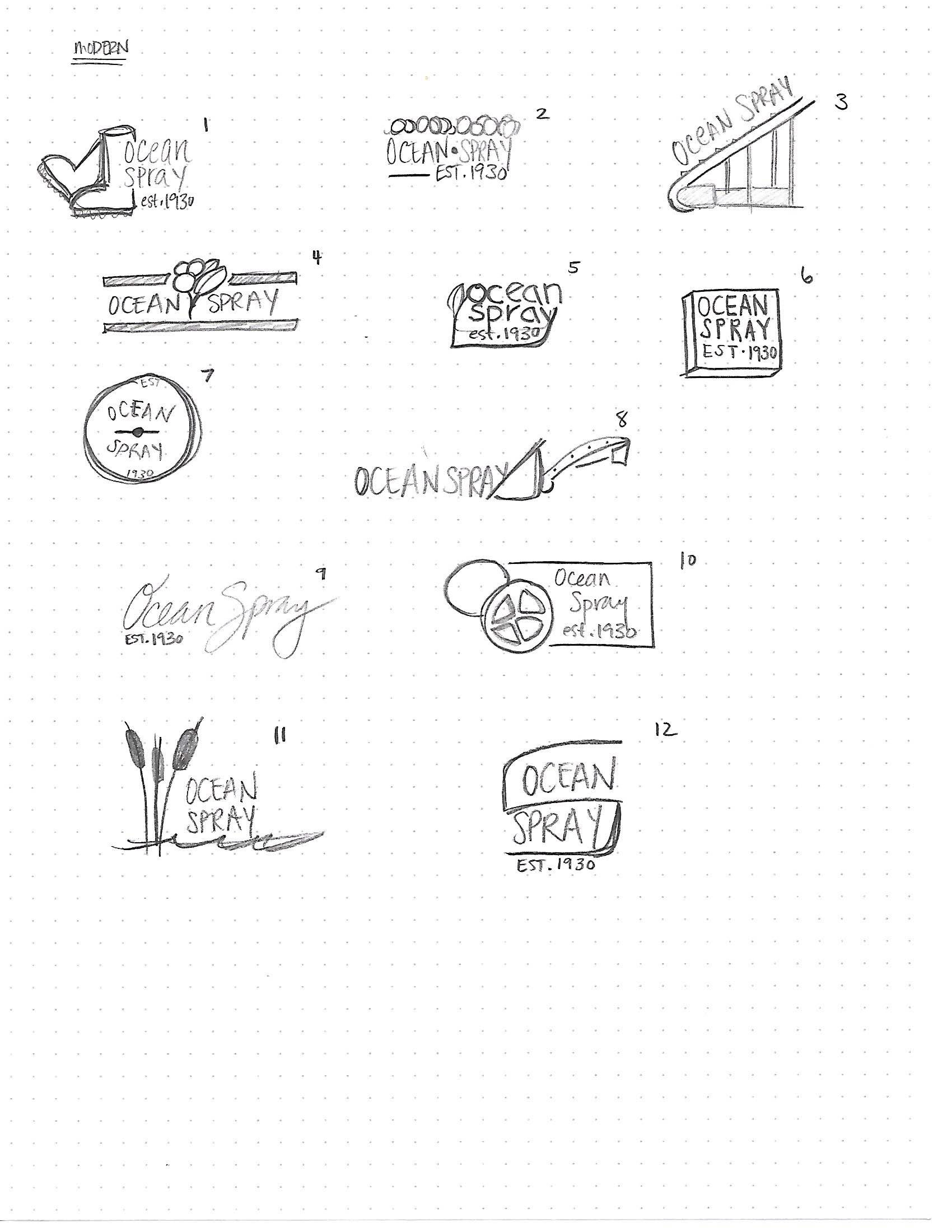
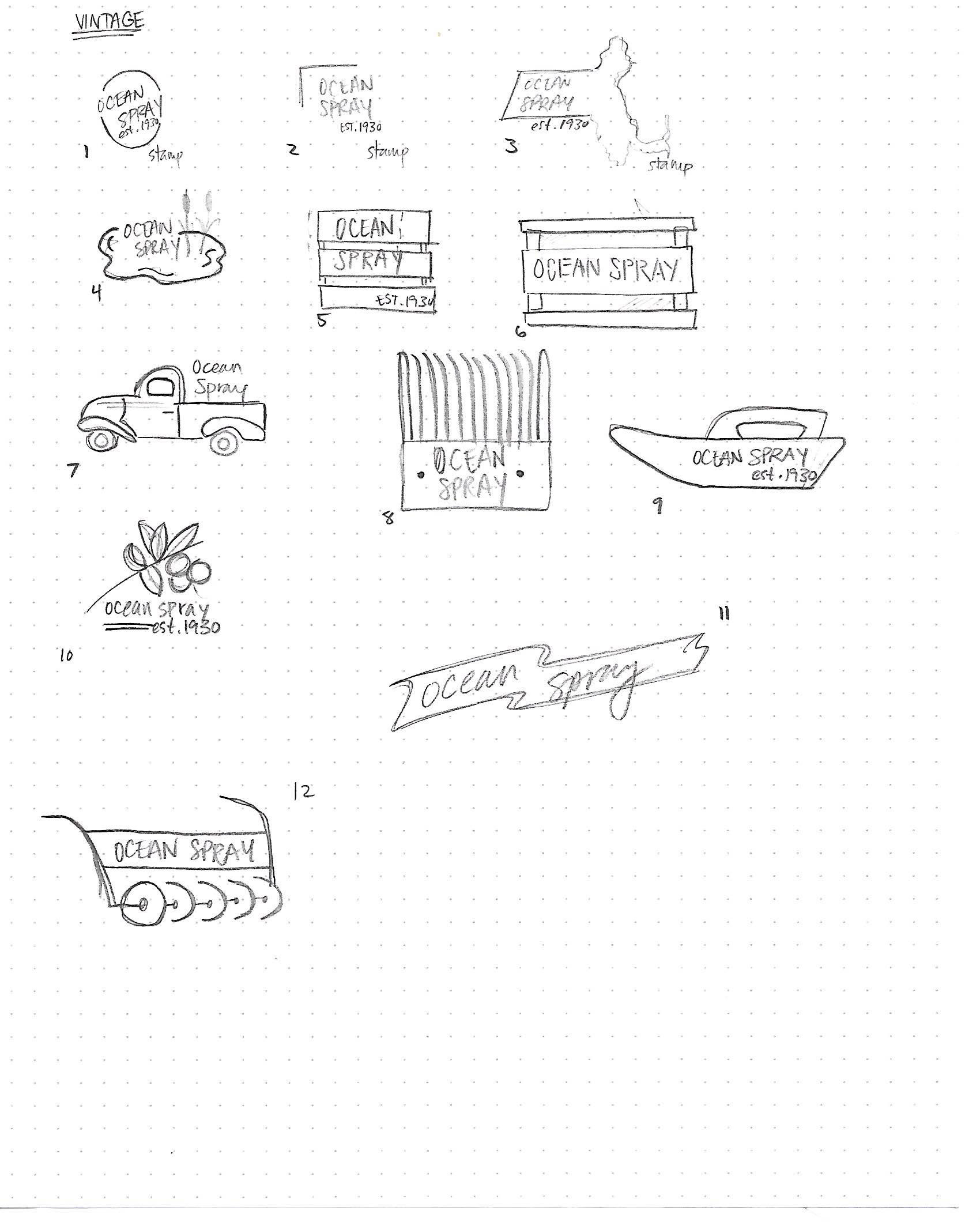
Preliminary sketches showing the exploration of the rebrand.